11A Web Page Layout Project

11A-WebDesignLayout-MargerySabolsky


11A-Sketch-MargerySabolsky


11A-ShapeMap-MargerySabolsky


Written process: My web page layout is for a Modern Art Museum. The website is designed to capture attention and provide information to potential museum patrons. I designed the layout for the website to draw attention to a photo carousel that encourages visitors to click on the photos and visit the Hirshhorn Exhibit.   It is also meant to be visually appealing to those that love modern art. I used simple lines, the primary colors of red, blue, and yellow and plenty of white space to bring a bright, energized feeling to the design. I designed the web page layout by gathering quality art images and using Photoshop to bring the design to life.

Critique Report: My critique came from a post on the Comm125 Facebook group. Classmate, Nancy Wells and Instructor, Kristen Larson responded. Since Nancy’s critique was only complimentary and not constructive I also, asked a friend, Kim Salins, who has a degree in graphic design from George Mason University to critique it. Based on the comments I used Photoshop to apply my edits. I resized the pictures and changed the directions of one of the ‘arrows’ to better represent a photo carousel. I also increased the font size and changed the alignment on the name of the exhibit and placed the ‘Buy Tickets’ and exhibit information in better proximity to the photo carousel.

Color Scheme: Primary. Red, Yellow and Blue

Font: Modern San Serif, Britannic Bold Regular, footer: San Serif Cambria Regular

Image Links:

Sun: http://tara-white.com/wp-content/uploads/2014/08/1-Sun-Yantra-Print-sat-copy.jpg

Don Quixote: https://encrypted-tbn0.gstatic.com/images?q=tbn:ANd9GcS5njPp5WaJshiXRLRCarU48Zkd3iZG3HYOXSKPy8gkRAaSIm8U

Stain Glass: http://archwall.xyz/wp-content/uploads/2015/11/modern-line-shape-form-design-space-colors-perfection-lines-modern-art-new-stain-glass-neo-plasticism-desktop-background-images.jpg

Tree: https://tommywd.files.wordpress.com/2010/12/agave_americana1.jpg

Facebook: http://www.kidojo.it/images/mobile_facebook.png

Twitter: http://static.wixstatic.com/media/a5eeb5_deb2f1ebd69046b793ce764d9d83c627.png

Instagram: http://www.smallmangalley.org/wp-content/uploads/2015/08/trans-insta.png


9A Photographic Study Project

Process:  I chose a 1960s Wurlitzer Jukebox for my project.  I used a Cannon digital camera.  Lighting was my biggest challenge, because of unwanted reflections and glare.  Also, I had to be careful when photographing the chrome because of reflections.  I used Light Room to enhance my photos and Photo Shop to create the collage.   It was both challenging and fun to come up with different angles and look at the details of the jukebox versus the jukebox as a whole.

jukebox-3

jukebox-12

jukebox-10

jukebox-14

9A-MargerySabolsky-Draft

Critique:

Dee Selph Wightman: Great colors. The only thing which stands out are The black lines around the odometer image. They aren’t the same size of your others in your collage.

Nancy Wells: This is fantastic, Margery! i love everything about it, except the type might need to be centered. But it’s kind of growing on me in that spot. Could you use the eyedropper to get the darker shade of yellow from the jukebox for the text? Wonderful! Nancy

I agreed wholeheartedly with their critiques and adjusted the font size to make it more centered, and the size and placement of the odometer square.  Also, of my own accord, I increased the spacing between the photos to make it more visually pleasing.

8C LFC Photography Activity

Outdoor-1

Outdoor Light


Indoor-2

Indoor Light


Foreground-3

Foreground


Background-4

Background


RuleofThirds-5

Rule of Thirds


LeadRoom-6

Lead Room

Once I overcame technical, lighting, and focus issues, I found photography to be fun.  I was especially impressed with the Lightroom software and its’ capabilities to enhance a photo.
Outdoor Lighting Picture:  I used the tip to use early morning or evening light.  I headed over to a local neighborhood pond and took my photos later in the day.  I was especially impressed with Light Room’s photo editing capabilities.  It took a bleak winter’s day picture and made it much more bright.
Indoor Lighting Picture:  This was my most difficult picture to come up.  It took me hours.  I finally settled on under-the-cabinet LED lighting in my kitchen.  I especially like the marbles in the picture.  This photo was greatly improved by adjusting shadows, clarity, vibrancy, and saturation.
Foreground and Background Picture:  I knew I wanted to use the glass globe, but again, hours later, despite understanding what settings to use, I could not get my camera to cooperate with the focus requirements.  I finally borrowed a friend’s camera for these two pictures.  Slight adjustments to contrast helped enhance these photos.
Rule of Thirds:  I used a gnome, placed on the left third line, and my backyard to come up with this picture.  I had to lie on my stomach to take it.  Temperature, tint, and highlight corrections benefited this picture.
Lead Room:  A bunny place on the right third line of the screen, looking left, provided my lead room photo.  I adjusted highlights, clarity, and blacks for this photo.

8A Social Media Marketing Project

8A-MargerySabolsky

Company: The Church of Jesus Christ of Latter-day Saints.

Objective: Promote a cause for those suffering with pornography addiction to seek help.

Purpose: To bring awareness to harsh statistics of pornography and encourage Christ-centered hope and healing.

Project: Infographic that can be posted on a website, Facebook, or Blog.

Strategy: Use an Infographic to draw attention to the devastating statistics and consequences of pornography addiction. Also, to encourage those with addictions to seek help through the Church of Jesus Christ of Latter-day Saints, and to participate in their Christ-centered 12-step Addiction Recovery Program.

Process: I created my Infographic using Piktochart software. I chose a dark background to visually capture the dark place pornography can put a person. I used an image of a man in despair to reinforce ‘dark’ and used the word, “Darkside” in the title. I researched information on the topic and gathered statistics. Simple graphic icons, like handcuffs, were used to get the harsh statistics across. As the chart flows it moves into a white background to bring light visually, and encourage hope and healing from addiction to pron. The chart promotes the Church of Jesus Christ of Latter-day Saints’ addiction recovery, Christ-centered, 12-Step program. Promoting recovery is accomplished with simple icons, like a band-aide.

The Church of Jesus Christ of Latter-day Saints believes in hope and healing through the Atonement of Jesus Christ. The leaders of the church have had to face the harsh realities that church members are not immune to addiction. In fact some statistics say Utah, where the church is headquartered, is #1 for online pornography consumption. The church has a program that can help those that struggle with addiction and their families recover from the devastating effects of addiction. This Infographic could help the church promote healing from addiction.

Fonts: Title: Archivo Narrow, san serif. Sub-titles: Glegoo, slab serif

Colors: Black with Teal, Hex value #218287

Critique Report: Dee Selph Wightman, Beth Mullen, Shelley Guthrie Tiffany, Nancy Wells, Lori Lee Hamblin, Carrie Fort and Judy Daines commented and/or made suggestions via FaceBook. Suggestions included to work on alignment and center some of the icons better, improve the font size and color to make it more readable, and switching the ‘heart’ icon to white on a black background. I also received a critique from tutor, Brent Fisher. He encouraged me to take the Infographic a step further and transition from dark to light and give more encouragement for recovery. I took all the critiques to heart and adjusted my Infographic accordingly.

Image Sources:

Icons: Cloud, Handcuff, Lock, Children, Person, Sand-Timer, Mail, Foot, Band-aide:   https://magic.piktochart.com/editor/piktochart/11502293

Discouraged man: http://www.sethskim.com/wp-content/uploads/2011/06/Discouraged-Man.jpg

Heart Icon: http://game-icons.net/icons/lorc/originals/png/broken-heart.png

Group Icon: https://image.freepik.com/free-icon/multiple-users-silhouette_318-49546.jpg

Christ Icon: http://cache2.asset-cache.net/gc/470785293-jesus-christ-icon-gettyimages.jpg?v=1&c=IWSAsset&k=2&d=N5rLvjHx7Q1qEW77d%2FPlMmqkII9rvyMgCPXjyrT0FGhUFAmra9v0tToF%2Fcj82f54


6A Slide Project


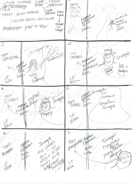
Talk: ‘A Prophet’s Counsel and Prayer for Youth,’ given in 2001 by Prophet Gordon B.  https://www.lds.org/ensign/2001/01/a-prophets-counsel-and-prayer-for-youth?lang=eng

Speaker’s Outline: A Prophet’s Counsel and Prayer for Youth

  1. Threshold of your mature lives
  •      God will not forsake you if walk in His path (Slide 1)
  •      Fortunate to be alive
  •      Counsel: You get the “A’s” I’ll give you the “B’s”
  1. Be Grateful (Slide 2)
  •      Say thank-you
  •      Be grateful for opportunities, friends, family, Lord
  •      Spirit of thanksgiving guide and bless you
  •      Work at it; yields wonderful results
  1. Be Smart (Slide 3)
  •      You need all the education you can get
  •      Train your minds and hand to become influences for good
  1. Be Clean (Slide 4)
  •      Your body is holy
  •      Entertainment, Language, Piercings, Tattoos, Pornography, Drugs, Chastity
  •      Choose friends wisely
  1. Be True (Slide 5)
  •      Be Loyal
  •      Covenants: Baptism, Sacrament
  •      Walk in Faith
  1. Be Humble (Slide 6)
  •       No place for arrogance, conceit, egotism
  •       “… the Lord thy God shall lead thee by the hand.”
  •       Teachable

Message: To encourage young woman to stay on the Lord’s path and chose His ways through six simple choices. Be grateful, smart, clean, true, humble, and prayerful.

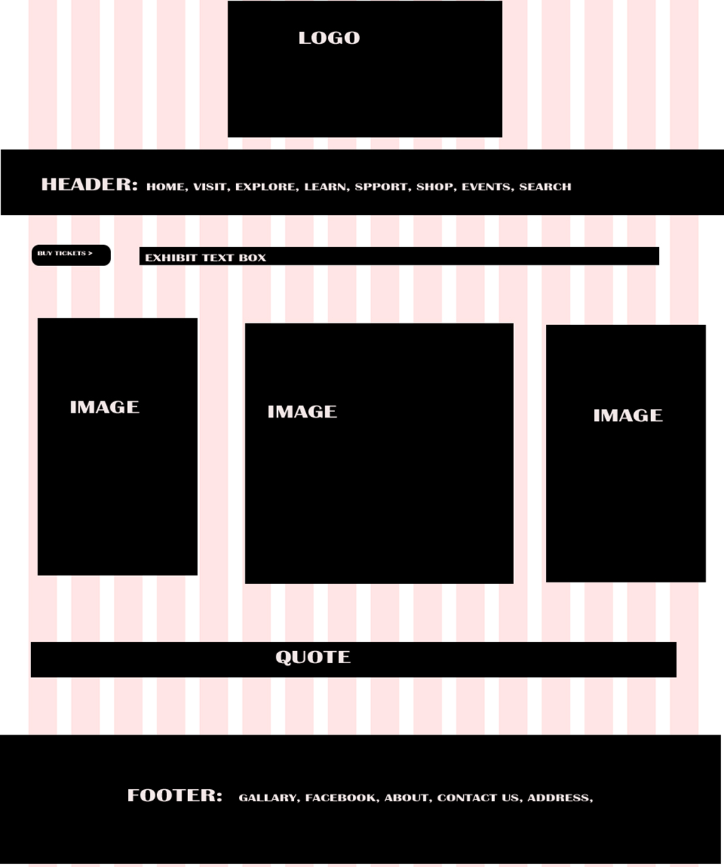
Process: Many hours later, I found quality images that matched my color scheme fairly well. Not an easy task. I used those images to create slides that had a simple look, that would be easy and calming on the eyes. I used the eyedropper for color, I rotated a number of images to be looking toward the text for better flow. In addition I cropped and adjusted the images to avoid them being centered. As a repeating element I used various weighted, colored lines; both horizontal and vertical.

Color Scheme: Analogous. Shades of Blues and Pinks (pinks are created with purple and red), Cool side of the color wheel, calming. Used eyedropper to match some of the colors in images.

Audience: Young Women ages 12 to 18 years of age.

Font: Sans Serif: Lucida Sans Unicode.

StoryBoardSketches jpg

Critique: My critiques are listed below. Although, I tried to use the ‘eye dropper’ to match the colors in the images, it backfired and many of my comments were to match the colors by slide not image so I made those changes, choosing a darker pink like suggested. My favorite critique was to switch between colors for the text box and font color which I did. I also added more repeating elements with weighted lines to add more variety.

Judy Daines I love your slides. I think the first slide has similar color palette (balloon) with the picture than the rest of the slides and that was the only thing that I might change. Beautiful talk. I wouldn’t be surprised if we have many talks that are the same. This was a significant talk that have touched so many of our youth in our church. Great job.

Shelley Guthrie Tiffany This is awesome! I love the bright, happy colors and uplifting images. Each is relevant to the point being made. Your theme is consistent. Great job!

Shelley Guthrie Tiffany Prayerful is the only one where the text is inside the image. Maybe consider putting it in a vertical text box along the left area, if possible, so your words are all in the left?

Dee Selph Wightman Try putting your slides in an album on our class page. That should work for getting them all in your post.

Cheryl Meinen Also noticed that grateful is greener looking than all the blue slides.

Connie Stanford Chatelain So far, the only suggestion I have is that the “prayerful” slide has the words by the image and all of the others have the word on the left.

Instructor: Kristen Newby Larson. Excellent images. Color scheme good. Two different pinks; darker pink better. “In general, I like.” Add a little more variety; not just left, try right or bottom. Consider switching between colors for the fonts and text boxes.

Images:

Slide 1: ‘Stay on HIS Path.’ Two little girls walking on path. https://hdwallpapers.cat/wallpaper_mirror/clouds_sunset_landscape_path_sisters_girl_hd-wallpaper-1810454.jpg

Slide 2: Grateful. Girl with pink balloons.  http://blog.novakdjokovicfoundation.org/media/2014/11/girl-with-balloons.jpg

Slide 3: Smart. Girl with magnifying glass. https://www.promiseprenatal.com/wp-content/uploads/2013/09/How-to-Help-Your-Child-to-Love-Learning.jpg

Slide 4: Clean. Girl with umbrella in rain. http://spiritualityhealth.com/sites/default/files/styles/article_header/public/gratefulrain.jpg?itok=pjklvBIi

Slide 5. True. Christ Baptism. http://iccwatertown.org/Portals/0/JesusBaptism.jpg

Slide 6. Humble. Dirty hands holding flower. https://khfirdavs.files.wordpress.com/2009/03/humble_gift_by_marielliott.jpg

Slide 7. Prayerful. Girl with hands folded in prayer. https://trivedimasterwellness.com/wp-content/uploads/2014/12/rsz_depositphotos_6469790_original.jpg


Event Flier Project

5A Event Flier - MSabolsky-1024jpg

5A Event Flier - M Sabolsky ScreenShot

Message / Audience:

My message is to invite my audience, food-lovers and the baker in all of us, to come together for a fund-raising cause that benefits childhood hunger. I started with the idea for the fundraiser, then I picked a benefactor, nokidhungry.org. I knew I wanted cookies and a child in my image so from there I went to task to find a high-quality image – easier said than done – that matched my criteria. From there I created my flier using Word. Despite some limitations, specifically the unforgiving ‘remove background’ feature, it is surprising what you can do with Word. It is certainly far more than a keyboarding software, and definitely an economical way to bring to life visual designs.

Colors & Scheme: My color scheme is Complimentary: Teal and Brick.   I created teal using color design, R0, G154, B161 and the shades of brick came from the colors in the cookies and the child.

Critique Report: Critiques came from classmates Sharon Coleman, Judy Daines, Paul Duhacek, and Rebecca Jones. Also, tutor Brent Fisher and instructor, Kristin Larson. Per Judy’s critique I moved the ‘benefactor’ and added .5 margins to that area of my design. Sis. Larson gave some ideas to work with the title; specifically I moved ‘Bake Off’ to the right. An improvement which I am pleased with. I also worked on ‘back ground’ removal to improve the quality of my design.

Font:

Title: AR Carter Decorative.

Body Copy: Arial Rounded MT Bold.

I stuck with a san serif for the body copy because the Decorative font was so ‘busy.’

Links to image sources

Cookie Jab / Child Image: http://www.theparentreport.com/wp-content/uploads/2012/02/2-496_girl_cookie_jar_lie_steal_discipline_ls_b.jpg

America’s Test Kitchen Logo: http://s3.amazonaws.com/production.mediajoint.prx.org/public/piece_images/350669/logo_atk_square_redwhite_rgb_800px_square.jpg

Pillsbury Logo: https://upload.wikimedia.org/wikipedia/en/thumb/c/ca/Pillsbury_logo.svg/1024px-Pillsbury_logo.svg.png

Beneficiary: https://www.nokidhungry.org/

4A Tasteful Topography Project

4ArszMargerySabolsky

Here is my project that I designed in Word

4ArszScreenShotMargerySabolsky

Audience: My audience is nature-lovers. My design would make a nice poster or piece of art work for those that believe in taking care of ‘mother earth’ and saving the plant.

Design Process: I started my design by looking for the body copy.   I was searching online for a poem by William Blake, and in the process I came upon what I used as my body copy: a poem by Christy Ann Martine.

Poem link: https://www.pinterest.com/pin/534943261969005439/

When I read the words, and the fact that there was a snow blizzard raging outside my window at the time, it made me think of the concept of “Mother Nature.” From there I looked for an image that would reflect this concept, using the quality image guidelines. Although the image I originally chose was under the ‘large’ category as instructed, I went back to the drawing board at near completion, when I panicked that that the image was not ‘quality’ enough. In the end I used a piece of artwork by Jen Toplak:

Image link: http://www.artistsnetwork.com/wp-content/uploads/JenToplak_Gaia_8x10_300dpi.jpg

My ‘complimentary design element’ is a piece of tree branch clip art that I used twice. It was originally a brown stick with green leaves. I adjusted the color to a gray scale, and used the artistic effect of ‘photocopy.’ I also rotated the branch so it could be used on both the left and right.

Title font: Perpetual Titling MT

Body Copy font: Mainadra GD

Critique Report: My critique process was three-fold. I posted on our class Facebook group. I received critiques from:   Judy Daines, Sharon Coleman, Lori Lee Hamblin, Dace Osin, and Rebecca Jones. I also took advantage of the opportunities to receive critiques from instructor, Kristen Newby Larson, and tutor, Brent Fisher. I received suggestions to work on the legibility of the body which I fixed by placing a green filled text box behind the body copy that was set to be transparent. I also received suggestions to not have the leaves touch the title as was the case in my draft, because it took away from the title. I adjusted the leaves accordingly.