

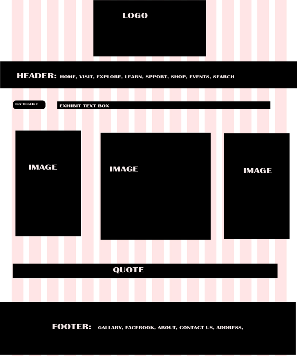
Written process: My web page layout is for a Modern Art Museum. The website is designed to capture attention and provide information to potential museum patrons. I designed the layout for the website to draw attention to a photo carousel that encourages visitors to click on the photos and visit the Hirshhorn Exhibit. It is also meant to be visually appealing to those that love modern art. I used simple lines, the primary colors of red, blue, and yellow and plenty of white space to bring a bright, energized feeling to the design. I designed the web page layout by gathering quality art images and using Photoshop to bring the design to life.
Critique Report: My critique came from a post on the Comm125 Facebook group. Classmate, Nancy Wells and Instructor, Kristen Larson responded. Since Nancy’s critique was only complimentary and not constructive I also, asked a friend, Kim Salins, who has a degree in graphic design from George Mason University to critique it. Based on the comments I used Photoshop to apply my edits. I resized the pictures and changed the directions of one of the ‘arrows’ to better represent a photo carousel. I also increased the font size and changed the alignment on the name of the exhibit and placed the ‘Buy Tickets’ and exhibit information in better proximity to the photo carousel.
Color Scheme: Primary. Red, Yellow and Blue
Font: Modern San Serif, Britannic Bold Regular, footer: San Serif Cambria Regular
Image Links:
Sun: http://tara-white.com/wp-content/uploads/2014/08/1-Sun-Yantra-Print-sat-copy.jpg
Don Quixote: https://encrypted-tbn0.gstatic.com/images?q=tbn:ANd9GcS5njPp5WaJshiXRLRCarU48Zkd3iZG3HYOXSKPy8gkRAaSIm8U
Tree: https://tommywd.files.wordpress.com/2010/12/agave_americana1.jpg
Facebook: http://www.kidojo.it/images/mobile_facebook.png
Twitter: http://static.wixstatic.com/media/a5eeb5_deb2f1ebd69046b793ce764d9d83c627.png
Instagram: http://www.smallmangalley.org/wp-content/uploads/2015/08/trans-insta.png

Margery, Last year I took World Foundations where we learned about great artists and art. Then my husband and I have attended several art museums over the past year. So this was a fun website design for me to see. You did a great job designing it. I love the bright colors and the pictures you chose. It has been fun seeing what everyone comes up with each week. I love how creative everyone is and how different the projects are. Nice work! https://fancyroseblog.wordpress.com/2016/03/17/11a-web-page-layout/
LikeLike
This is such a great webpage Margery! I really enjoyed looking at these paintings. I am from the Washington D.C. area so I have visited the Modern Museum of Art here many times and it such a spectacular place! I like the layout of your webpage and I think you blended everything very well. The header is one of the paintings that really stands out to me as it really makes the webpage pop. I also like how you started with a simple black and white design and then incorporated the paintings to make the webpage colors come through. I can tell you really put a lot of thought into this assignment. Great job!
Link to My Blog: https://joselidalva.wordpress.com/
LikeLike
Link to Another Classmates Blog: https://serenepeterson.wordpress.com/2016/03/18/11a-web-layout-project/comment-page-1/#comment-15
LikeLike