8C LFC Photography Activity

Outdoor-1

Outdoor Light


Indoor-2

Indoor Light


Foreground-3

Foreground


Background-4

Background


RuleofThirds-5

Rule of Thirds


LeadRoom-6

Lead Room

Once I overcame technical, lighting, and focus issues, I found photography to be fun.  I was especially impressed with the Lightroom software and its’ capabilities to enhance a photo.
Outdoor Lighting Picture:  I used the tip to use early morning or evening light.  I headed over to a local neighborhood pond and took my photos later in the day.  I was especially impressed with Light Room’s photo editing capabilities.  It took a bleak winter’s day picture and made it much more bright.
Indoor Lighting Picture:  This was my most difficult picture to come up.  It took me hours.  I finally settled on under-the-cabinet LED lighting in my kitchen.  I especially like the marbles in the picture.  This photo was greatly improved by adjusting shadows, clarity, vibrancy, and saturation.
Foreground and Background Picture:  I knew I wanted to use the glass globe, but again, hours later, despite understanding what settings to use, I could not get my camera to cooperate with the focus requirements.  I finally borrowed a friend’s camera for these two pictures.  Slight adjustments to contrast helped enhance these photos.
Rule of Thirds:  I used a gnome, placed on the left third line, and my backyard to come up with this picture.  I had to lie on my stomach to take it.  Temperature, tint, and highlight corrections benefited this picture.
Lead Room:  A bunny place on the right third line of the screen, looking left, provided my lead room photo.  I adjusted highlights, clarity, and blacks for this photo.

8A Social Media Marketing Project

8A-MargerySabolsky

Company: The Church of Jesus Christ of Latter-day Saints.

Objective: Promote a cause for those suffering with pornography addiction to seek help.

Purpose: To bring awareness to harsh statistics of pornography and encourage Christ-centered hope and healing.

Project: Infographic that can be posted on a website, Facebook, or Blog.

Strategy: Use an Infographic to draw attention to the devastating statistics and consequences of pornography addiction. Also, to encourage those with addictions to seek help through the Church of Jesus Christ of Latter-day Saints, and to participate in their Christ-centered 12-step Addiction Recovery Program.

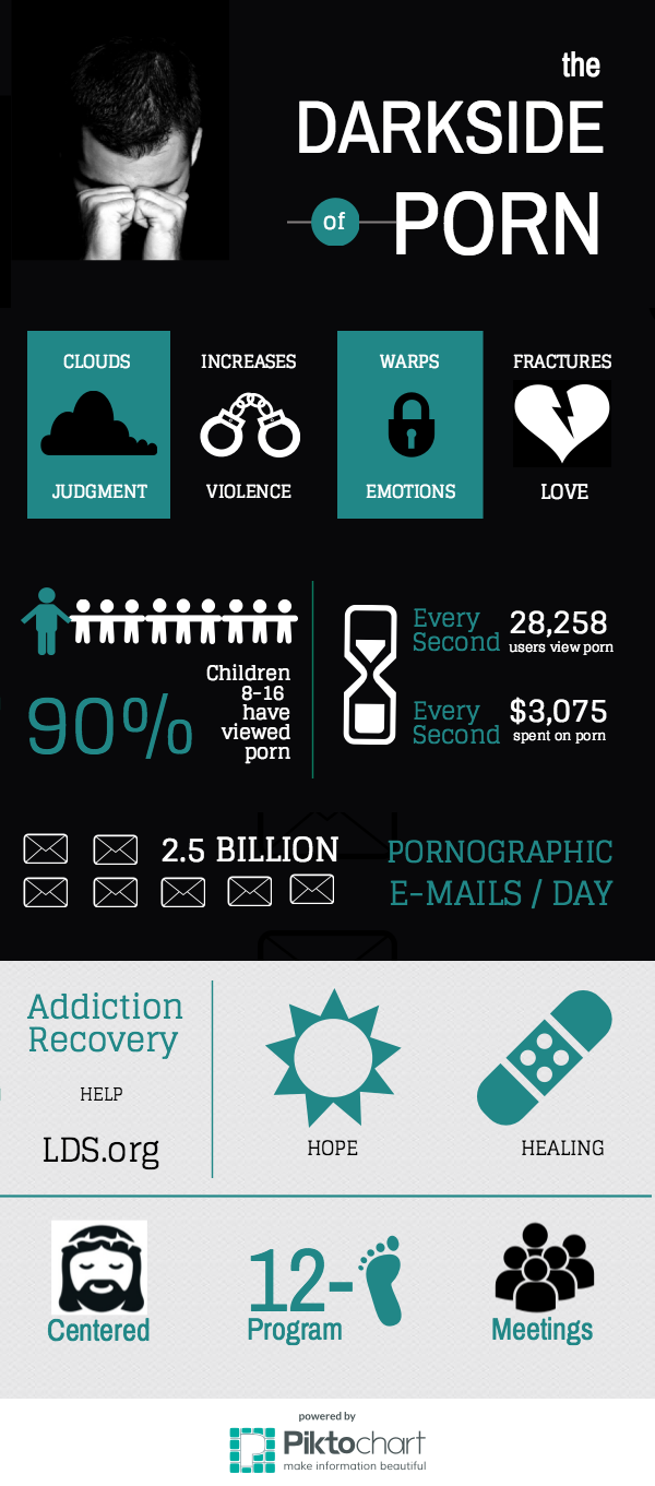
Process: I created my Infographic using Piktochart software. I chose a dark background to visually capture the dark place pornography can put a person. I used an image of a man in despair to reinforce ‘dark’ and used the word, “Darkside” in the title. I researched information on the topic and gathered statistics. Simple graphic icons, like handcuffs, were used to get the harsh statistics across. As the chart flows it moves into a white background to bring light visually, and encourage hope and healing from addiction to pron. The chart promotes the Church of Jesus Christ of Latter-day Saints’ addiction recovery, Christ-centered, 12-Step program. Promoting recovery is accomplished with simple icons, like a band-aide.

The Church of Jesus Christ of Latter-day Saints believes in hope and healing through the Atonement of Jesus Christ. The leaders of the church have had to face the harsh realities that church members are not immune to addiction. In fact some statistics say Utah, where the church is headquartered, is #1 for online pornography consumption. The church has a program that can help those that struggle with addiction and their families recover from the devastating effects of addiction. This Infographic could help the church promote healing from addiction.

Fonts: Title: Archivo Narrow, san serif. Sub-titles: Glegoo, slab serif

Colors: Black with Teal, Hex value #218287

Critique Report: Dee Selph Wightman, Beth Mullen, Shelley Guthrie Tiffany, Nancy Wells, Lori Lee Hamblin, Carrie Fort and Judy Daines commented and/or made suggestions via FaceBook. Suggestions included to work on alignment and center some of the icons better, improve the font size and color to make it more readable, and switching the ‘heart’ icon to white on a black background. I also received a critique from tutor, Brent Fisher. He encouraged me to take the Infographic a step further and transition from dark to light and give more encouragement for recovery. I took all the critiques to heart and adjusted my Infographic accordingly.

Image Sources:

Icons: Cloud, Handcuff, Lock, Children, Person, Sand-Timer, Mail, Foot, Band-aide:   https://magic.piktochart.com/editor/piktochart/11502293

Discouraged man: http://www.sethskim.com/wp-content/uploads/2011/06/Discouraged-Man.jpg

Heart Icon: http://game-icons.net/icons/lorc/originals/png/broken-heart.png

Group Icon: https://image.freepik.com/free-icon/multiple-users-silhouette_318-49546.jpg

Christ Icon: http://cache2.asset-cache.net/gc/470785293-jesus-christ-icon-gettyimages.jpg?v=1&c=IWSAsset&k=2&d=N5rLvjHx7Q1qEW77d%2FPlMmqkII9rvyMgCPXjyrT0FGhUFAmra9v0tToF%2Fcj82f54


4A Tasteful Topography Project

4ArszMargerySabolsky

Here is my project that I designed in Word

4ArszScreenShotMargerySabolsky

Audience: My audience is nature-lovers. My design would make a nice poster or piece of art work for those that believe in taking care of ‘mother earth’ and saving the plant.

Design Process: I started my design by looking for the body copy.   I was searching online for a poem by William Blake, and in the process I came upon what I used as my body copy: a poem by Christy Ann Martine.

Poem link: https://www.pinterest.com/pin/534943261969005439/

When I read the words, and the fact that there was a snow blizzard raging outside my window at the time, it made me think of the concept of “Mother Nature.” From there I looked for an image that would reflect this concept, using the quality image guidelines. Although the image I originally chose was under the ‘large’ category as instructed, I went back to the drawing board at near completion, when I panicked that that the image was not ‘quality’ enough. In the end I used a piece of artwork by Jen Toplak:

Image link: http://www.artistsnetwork.com/wp-content/uploads/JenToplak_Gaia_8x10_300dpi.jpg

My ‘complimentary design element’ is a piece of tree branch clip art that I used twice. It was originally a brown stick with green leaves. I adjusted the color to a gray scale, and used the artistic effect of ‘photocopy.’ I also rotated the branch so it could be used on both the left and right.

Title font: Perpetual Titling MT

Body Copy font: Mainadra GD

Critique Report: My critique process was three-fold. I posted on our class Facebook group. I received critiques from:   Judy Daines, Sharon Coleman, Lori Lee Hamblin, Dace Osin, and Rebecca Jones. I also took advantage of the opportunities to receive critiques from instructor, Kristen Newby Larson, and tutor, Brent Fisher. I received suggestions to work on the legibility of the body which I fixed by placing a green filled text box behind the body copy that was set to be transparent. I also received suggestions to not have the leaves touch the title as was the case in my draft, because it took away from the title. I adjusted the leaves accordingly.